The Matters of Matting: 3 Unique & Fun Matting Ideas to Spice Up Your Framed Art
Photo by Jackie Hope on Unsplash
There’s one watershed moment that stands out in my memory as the demarcation between my childhood (which extended well into my twenties) and my adulthood. It wasn’t getting my braces off (but thank god for that), graduating from college, or even signing the lease on my first apartment. For me, my transition into the wide, scary world of adulthood is best summed up the day I stopped using thumbtacks and bulldog clips and hung up my first piece of framed art.
Honestly, this might have been partly due to the fact that the dang thing cost so much money, and what is adulting if not stressing over your financial situation? But mostly it was because, once I’d hammered my first nail into the wall and hung my new masterpiece above the sofa (which my roommates and I had rescued from the side of the road, no less), I knew I could never go back.
There’s something about a frame that takes a piece of art, and the entire room its presence graces, to a whole new level. But there’s no question that framing can be scary—you have an overwhelming number of options, meaning an equal number of ways to make a bad (not to mention expensive and more-or-less permanent) decision. Gosh, who knew framing would be such an apt metaphor for life.
But the good news is that, even with all of those options, you really can’t screw it up but so badly. In fact, framing (and all the choices/possibilities that come with it) can be really fun! You just have to know what your options are. So, on that note, I’m going to share a few of my favorite tips and ideas for the niche sub-topic of matting—spoiler alert: the world is a lot wider than just black frames and white mats!
Without further adieu, here are 3 of my favorite tips, tricks, and ideas to try!
1. Skip the Mat
Hold onto your hats, people—we’re kicking things off with a bang! Consider framing your art without a mat.
Ok, ok. I will acknowledge that it’s generally true that framed art usually looks better with a mat. That said, it is still perfectly acceptable to break this rule once in a while and go mat-free! Of course, knowing when to do so (and when not to) is the tricky part.
It can help to understand the reason why we mat things in the first place. Mats visually separate your artwork from the wall it’s hung on and they give the art breathing room, which helps our eyes focus and take in the work. Without a mat, some pieces can give off a poster-like vibe (no shade to posters), but adding a mat elevates the overall look and gives you that fine art polish.
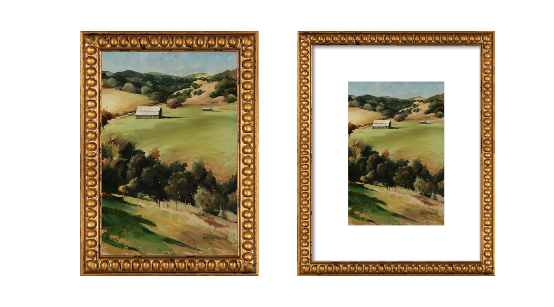
The same painting (Nyland Ranch by Georgesse Gomez for Artfully Walls) frames with and without a mat.
That said, it can be really fun and unexpected to frame certain pieces full bleed (the technical term for no mat). A few of my favorite places/types of art to try this with are…
In a gallery wall! Gallery walls are tricky, but one key to acing them is variation. An easy way to do this? Include a piece or two without a mat! This will help give your gallery wall depth and make the overall look feel really dynamic (also great if you’re going for more of an eclectic style). Consider mat-less art your new secret weapon to kicking your gallery wall game up a notch. And get ready to leave your guests marveling at your interior decorating skills (“Maybe she’s born with it, maybe her art doesn’t have a mat!”).
Large scale photography. Nothing like a big, bold, full bleed photograph. If your design style leans modern or contemporary, photography is a great art choice to complement your style. Consider making your next art acquisition a large-scale photo and framing it sans mat for a more dramatic, contemporary look.
Fine art subjects. Ok, stick with me on this one. I love a good lesson in juxtaposition, and fine art subject matter is the perfect place to play with expectations around framing and matting. Quick definition in terms: “fine art subject matter” is a fancy way of saying that a piece of art is portraying objects or ideas that are rooted in more historic ideas of fine art. For example, still lifes, landscapes, and classic portraiture are all typical fine art subjects. Because this type of art conjures up traditional associations, we expect it to be framed in a formal way (with a mat and probably a large, ornate gold frame too). By contrast, frames with no mats feels more casual, and I love the juxtaposition of a formal type of art with an informal framing technique!
2. Play With the Size of Your Mat
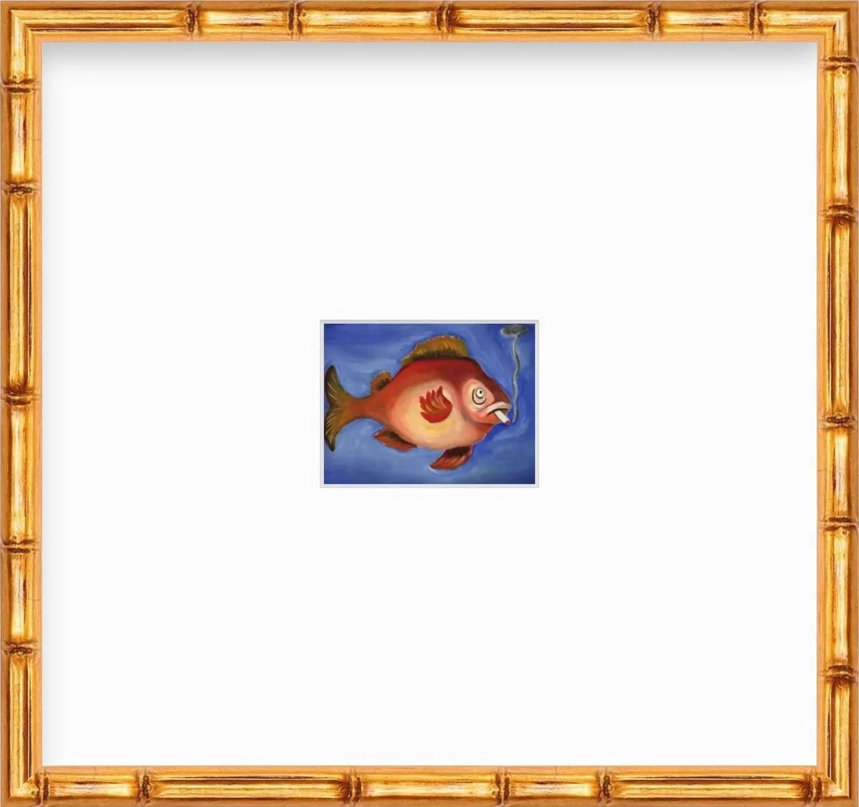
One of my all-time favorite framing techniques is the combination of teeny, tiny art (I’m talking just a few square-inches) framed inside a ginormous mat. This works great with art that is intricate or unique enough that you need to get up close to see it. Take my painting of one Mr. Smoking Fish above, for example.
But, unlike small art with standard mat proportions, the addition of a big, bold mat means that your art will physically take up more wall space (which can be a good thing if you have a lot of space to fill) and its larger size signals a greater importance in our minds. It’s a visual oxymoron, and who can say no to that?
Aside from mega mats all around, you can also change up the width of your mat between the top and bottom, left and right sides of the artwork. This can be an aesthetic choice or practical one.
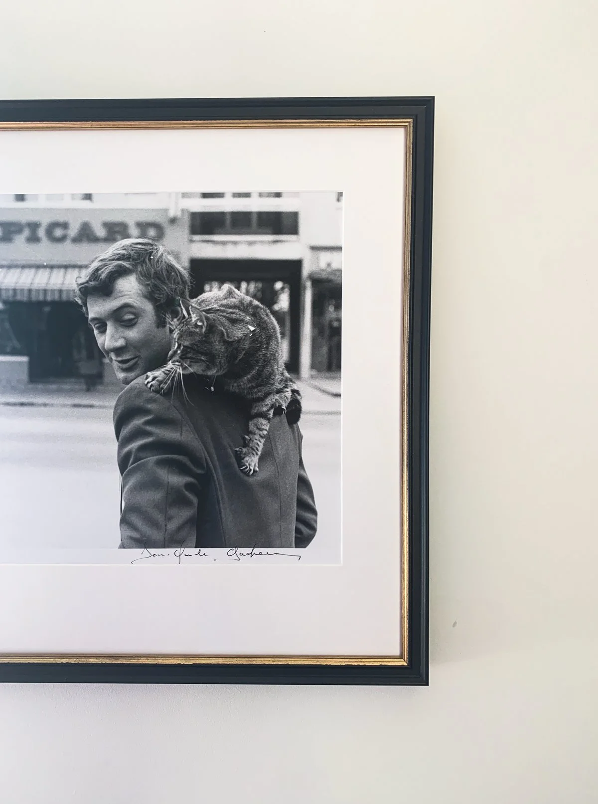
For example, some museums will actually use mats that are slightly wider on the bottom border. This is because the curvature of our eyes can make the bottom border appear smaller, even if it’s not, so by intentionally widening it just a tad, you can counteract the optical illusion. Kind of like how the ancient Greeks and Romans convexly tapered columns.
This works as an aesthetic choice too. Above is a photo I recently had framed and I asked for the bottom mat border to be ~an inch and a half wider than the rest. Why? If you look closely you can see that there’s a strip of white at the bottom of the photo with the artist’s signature. I wanted to keep this visible when framed, but didn’t want the extra white space at the bottom to make the piece feel unbalanced. So, after chatting with the employee at the frame shop, we decided to extend that mat even more to make it feel intentionally larger and keep the signature visible. It also visually mimics the look of a classic polaroid photo, which I love!
3. Consider a Colorful Mat!
Who says mats always have to be white? While most online framed art retailers will default to a simple white mat, this usually isn’t your only option (it certainly won’t be at local framing stores, which have tons of matting options).
And while choosing a non-white mat might feel like a bold move, sometimes it’s actually a much needed swap to showcase your art in its best light. If you’re framing an older print or piece on a neutral-toned paper (perhaps it's yellowed from age) a stark white mat could make your art look a bit sallow. Instead, pick a mat that complements the undertone of your art.
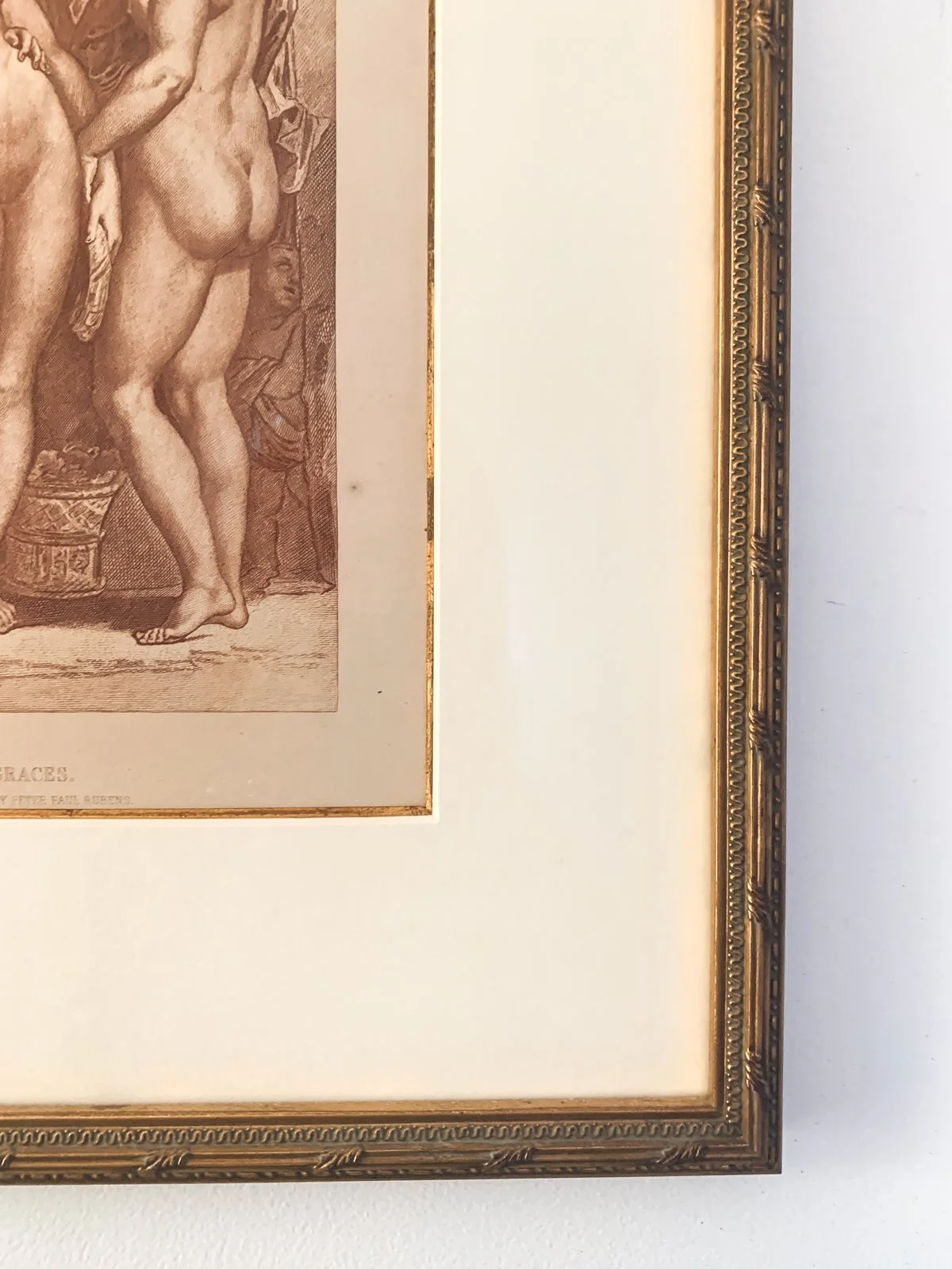
For example, I got this reproduction of a Peter Paul Rubens print framed a few years ago, and opted for a warm neutral mat to complement the warm tone of the paper.
Bonus round: You can also add two mats like I did here! Peek the subtle rim of gold on the inside of the mat. That’s actually a second mat layered under the main one. It adds depth and a little sumthin-sumthin to the look while tying in the gold of the frame.
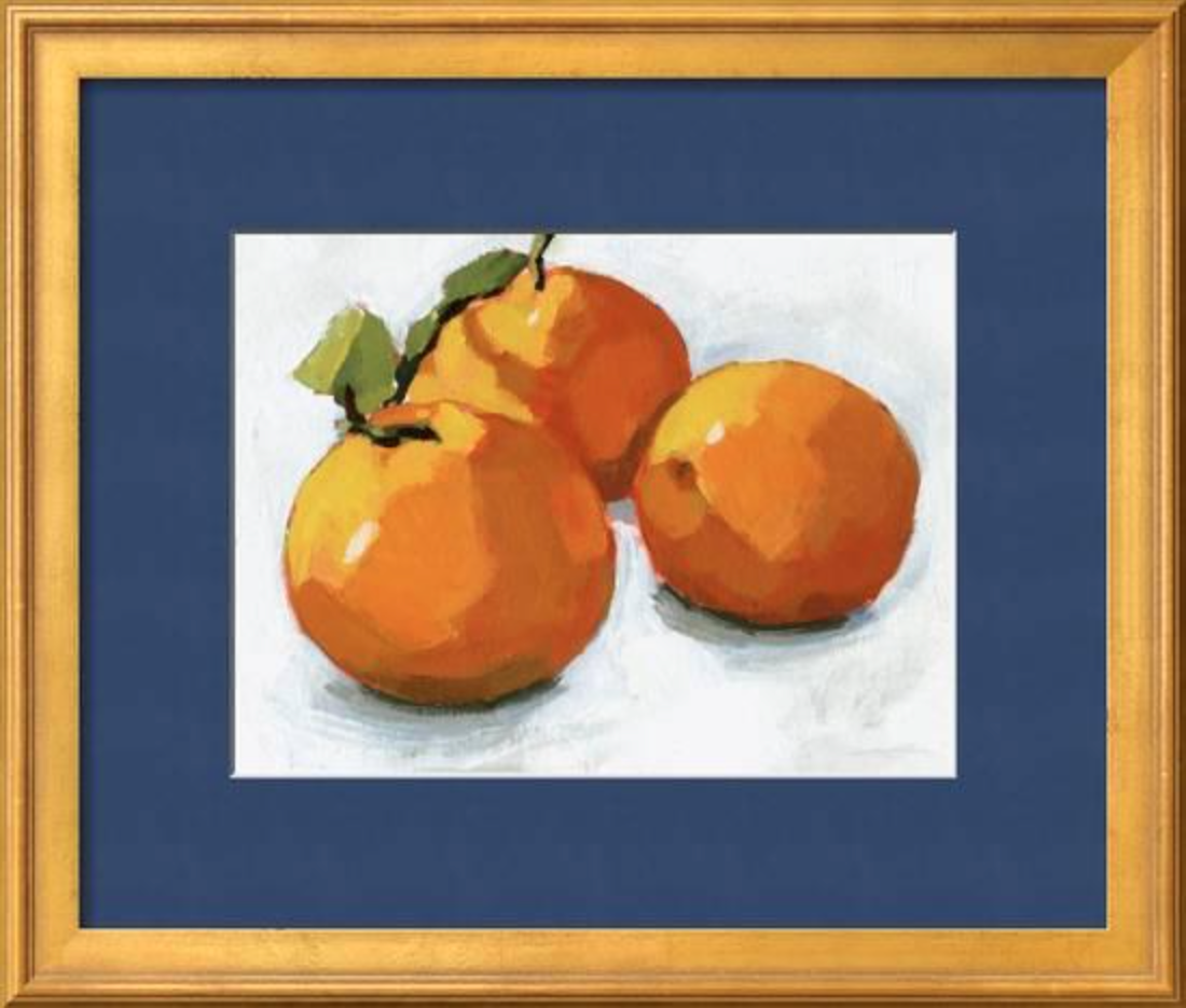
And if that’s not enough for ya, go full-out with a colorful mat! This is a little more daring, so choose wisely as you can’t really swap out a mat later. I love this for simple compositions like the above trio of oranges. I chose this navy blue mat (note that blue is the complementary color to orange), which highlights the darker shadows in the piece and brings it to life in a way that simple white couldn’t.


