The Render (Episode 1): Discovering Your Personal Interior Design Style and What It Says About You
Welcome to the visual companion to the first episode of Modsy’s new podcast, The Render. The Render is a podcast hosted by Modsy’s very own Alessandra Wood and Maddy Warner, and is all about the untold stories from the world of interior design.
Tune in to the very first episode where Maddy and Alessandra break down 9 popular interior design styles. Together, they’ll chat about how you can spot these different interior design styles in the wild, unpack the history behind them, and give you tips on how you can start to define your own personal style and bring it to life.
The Render is available on Apple Podcasts, Spotify, or wherever you listen to your podcasts!
If you’ve ever taken an online style quiz, you’ve probably been told your style is Mid-Century Modern, Rustic, or maybe even Traditional. And while those descriptions are a great starting point, unless you’re on the design savvier side it can be difficult to translate that description into a cohesive design for your home.
Not to mention, a one-word style description doesn’t leave a whole lot of wiggle room for your individuality. Can we really say that there are only a few styles to choose from and everyone fits perfectly into one? We don’t think so.
Instead, at Modsy we like to think about personal style as a recipe—you’ve got your ingredients but it’s up to you to mix and match them to suit your unique tastes. Read on for our complete tour of 9 pure interior design styles. Be sure to tune into the first episode of the Render for the complete behind the scenes take on each style!
Classic Formal Design
In the words of Alessandra, if you grew up with a grandmother that wouldn’t let you go in the living room, it was probably decorated in classic style. A style that “is what it sounds like,” classic formal design is refined, formal, rich, and polished.
This design style is based on French and European antiques and you’ll find a strong emphasis on symmetry and proportion along with decorative elements like toile and chinoiserie patterns, furniture with ball and claw feet, dark woods, gilded materials, and pieces in perfect, pristine condition.
Chinoiserie Pattern
A look that was inspired by Asian patterns including pagodas and pastoral scenes. Beginning during the Rococo era, French people were looking toward China and getting inspired by their textiles and pottery.
Toile Pattern
Similar to chinoiserie, toile is a pattern that showcases pastoral vignettes. You’ve probably seen it in wallpaper or fabric designs, or even in an IKEA shower curtain!
Classic formal design in popular culture
Have you seen classic formal style used to decorate the homes of your favorite movie or TV characters? Chances are those people are high-powered, wealthy, and aligned with more “traditional” values. Here are some of the places we see classic formal style in popular culture!
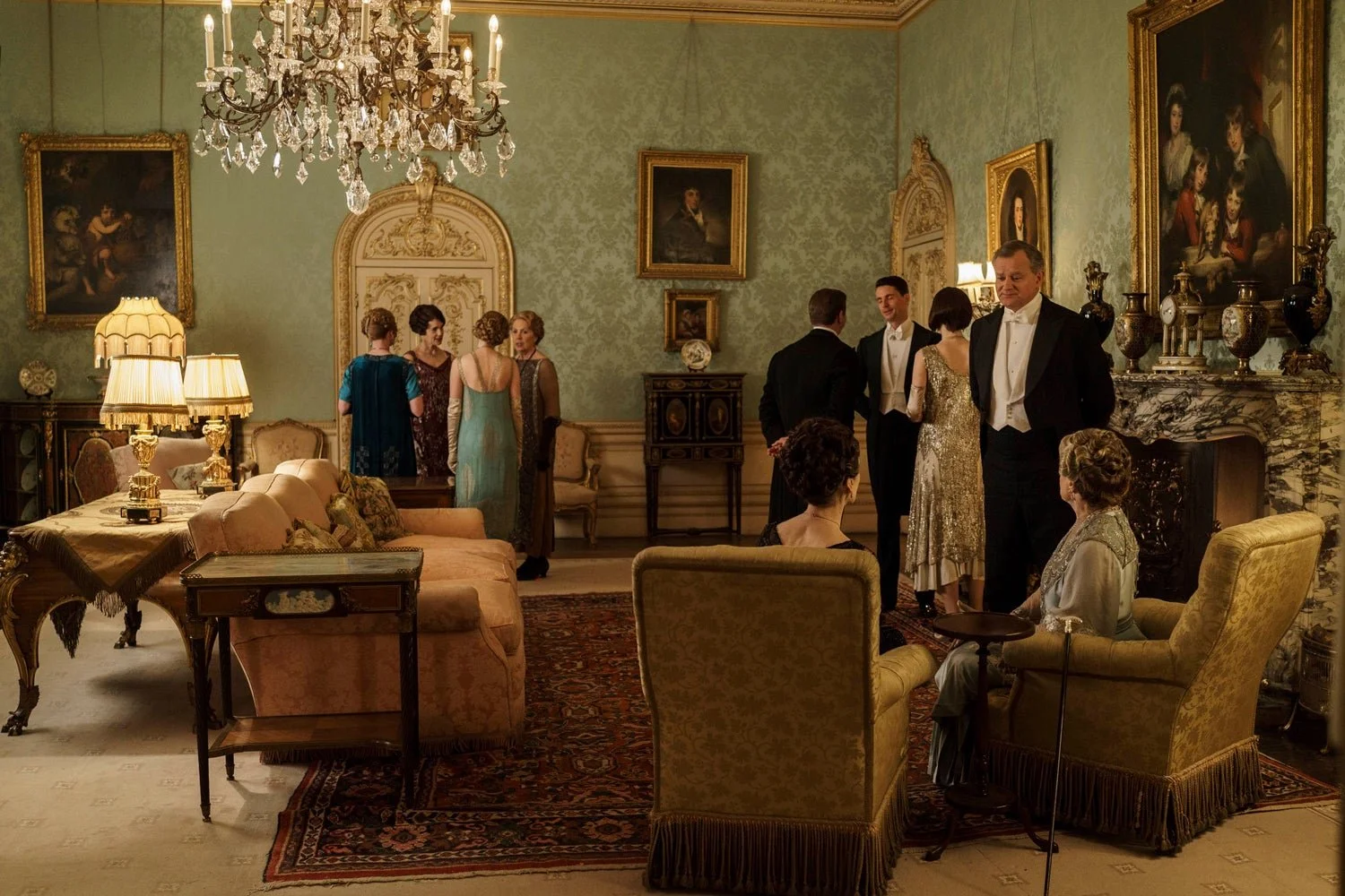
Downton Abbey
A great example of classic formal style in period, Downton Abbey, showcases the color palette, shapes and silhouettes, and the overall vibe of how a space designed in classic formal style makes us feel.
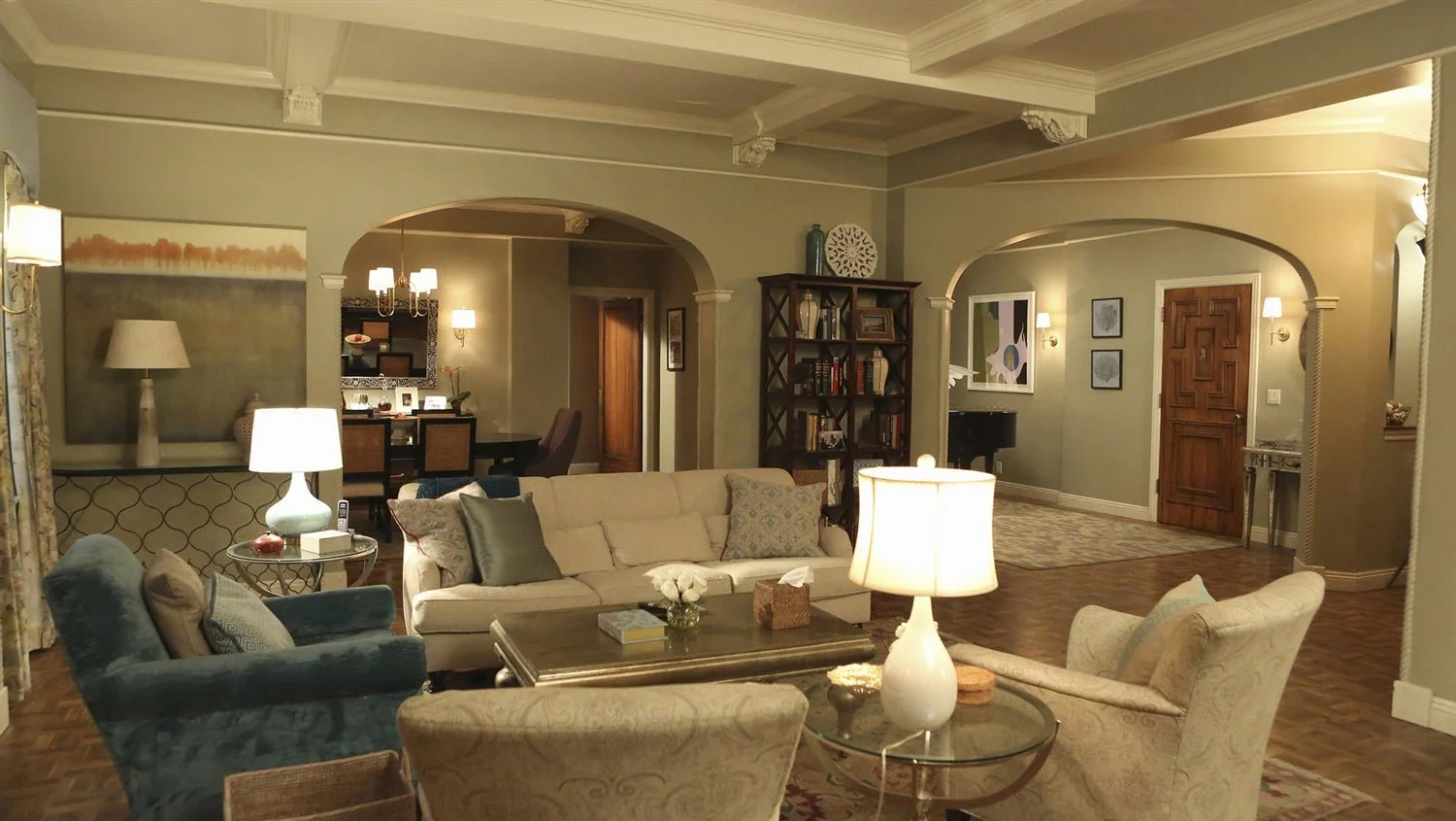
Olivia Pope’s Apartment, Scandal
Check out that valance!
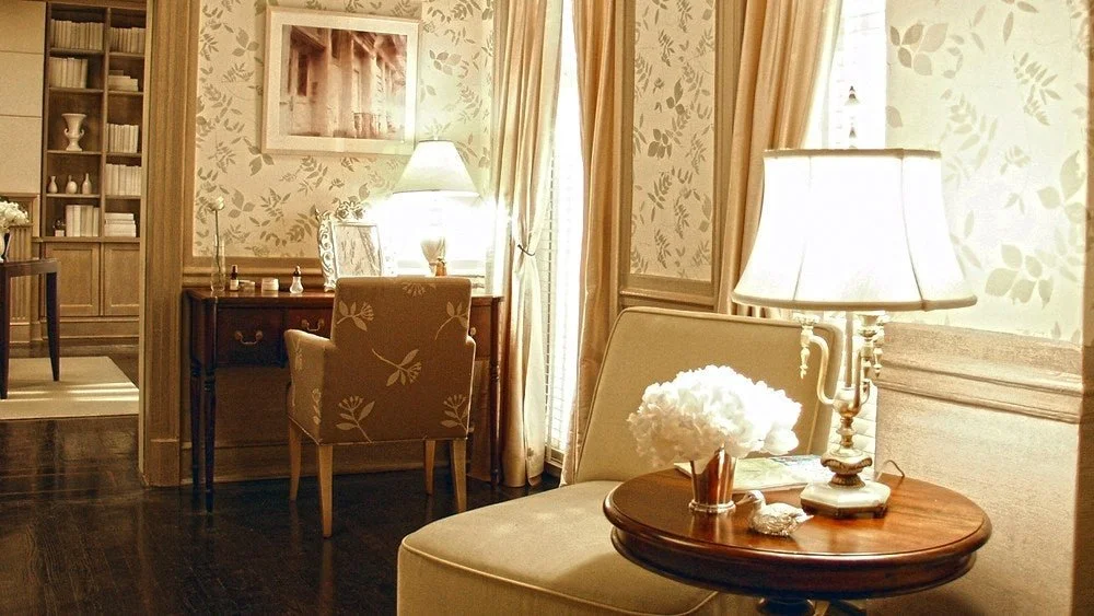
Charlotte York’s Apartment, Sex and The City
Classic Charlotte!
Traditional Design
Not to be confused with classic formal, traditional style is rooted in early American design and is a less formal and more livable design style. In these interiors you’ll find an emphasis on the beauty of raw materials (mostly dark woods like mahogany and walnut) and excellent craftsmanship.
This style is synonymous with the White House and George Washington, and the greatest difference between classic and traditional design lies in their motives. Our Founding Fathers wanted to align themselves with “the people” and they used this design style, which was inspired by the puritan roots of America, to differentiate themselves from the regimes of Europe (think Marie Antoinette).
Traditional design in popular culture
Calling all Hamilton fans, this is the style that would have made Alexander proud. But where else do we see traditional design in TV shows and movies? This style is rooted in comfort and to us is synonymous with the designs of the 90s—think all your favorite 90s sitcoms!
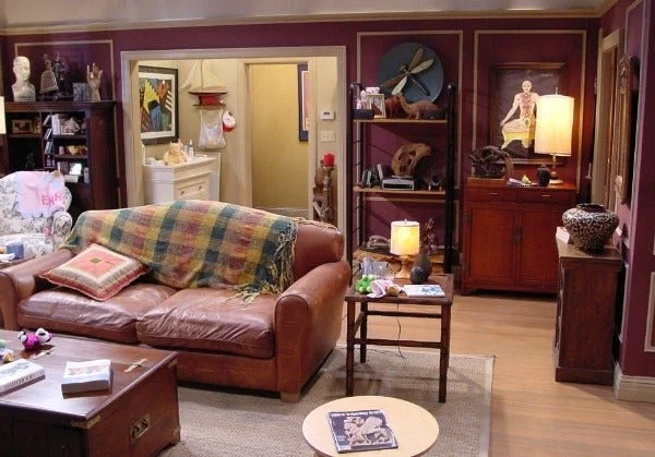
Ross’ Apartment, Friends
Ross’s apartment from Friends was chock-full of traditional design.
Minimalist Design
Ever heard the adage “form follows function?” Or how about “less is more.” Both of those ideas were born out of the Minimalist Movement! Another style that is exactly what it sounds like, minimalist design is understated, not superfluous, and all about committing to this idea of how do we design and create things that give you just what you need?
In these spaces you’ll find little ornamentation, lots of sleek and streamlined forms, and raw materials. The Minimalist designers were reacting to a cluttered life and wanted to bring “good design” (something that was beautiful and useful) to masses of people through industrial production.
Minimalist design in popular culture
Funnily enough, minimalist design is commonly used to decorate interiors of futuristic spaces and the homes of serial killers.
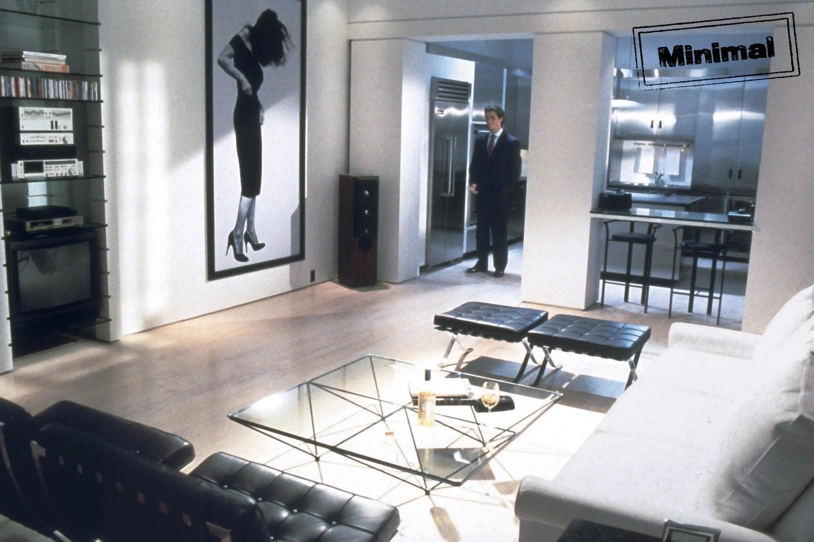
Patrick Bateman’s Apartment, American Psycho
What he lacks in moral conscience, he makes up for in style. Just look at those Barcelona chairs, which were an iconic design of the Minimalist Movement. GQ even agrees with our theory that serial killers love minimalism.
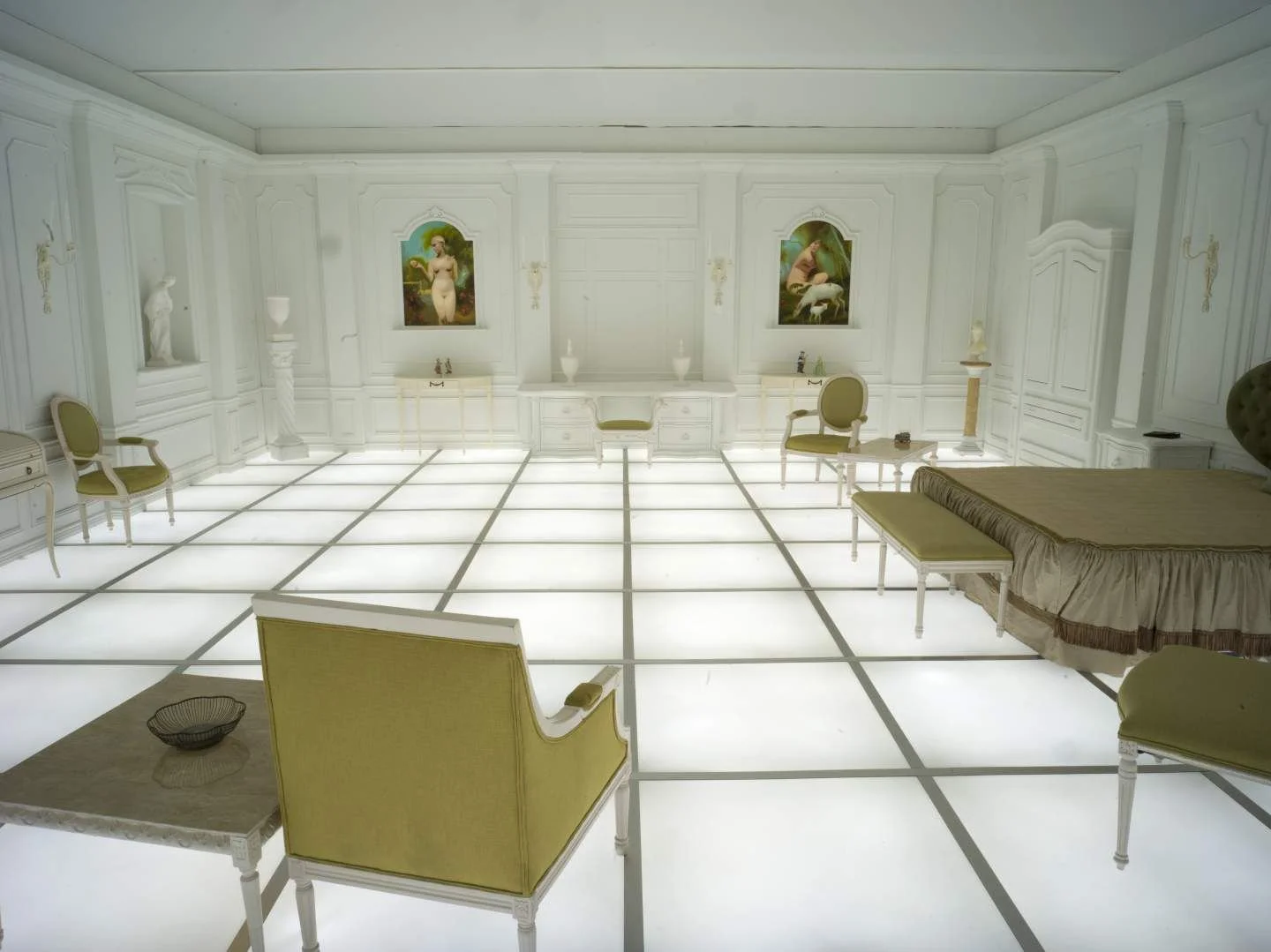
2001: A Space Odyssey
Stanley Kubrick’s vision of the future is all about less is more!
Marie Kondo
We’ve all heard the idea of sparking joy! Marie Kondo has put minimalism back on trend with her popular book (and Netflix series) on The Life-Changing Magic of Tidying Up.
Mid-Century Modern Design
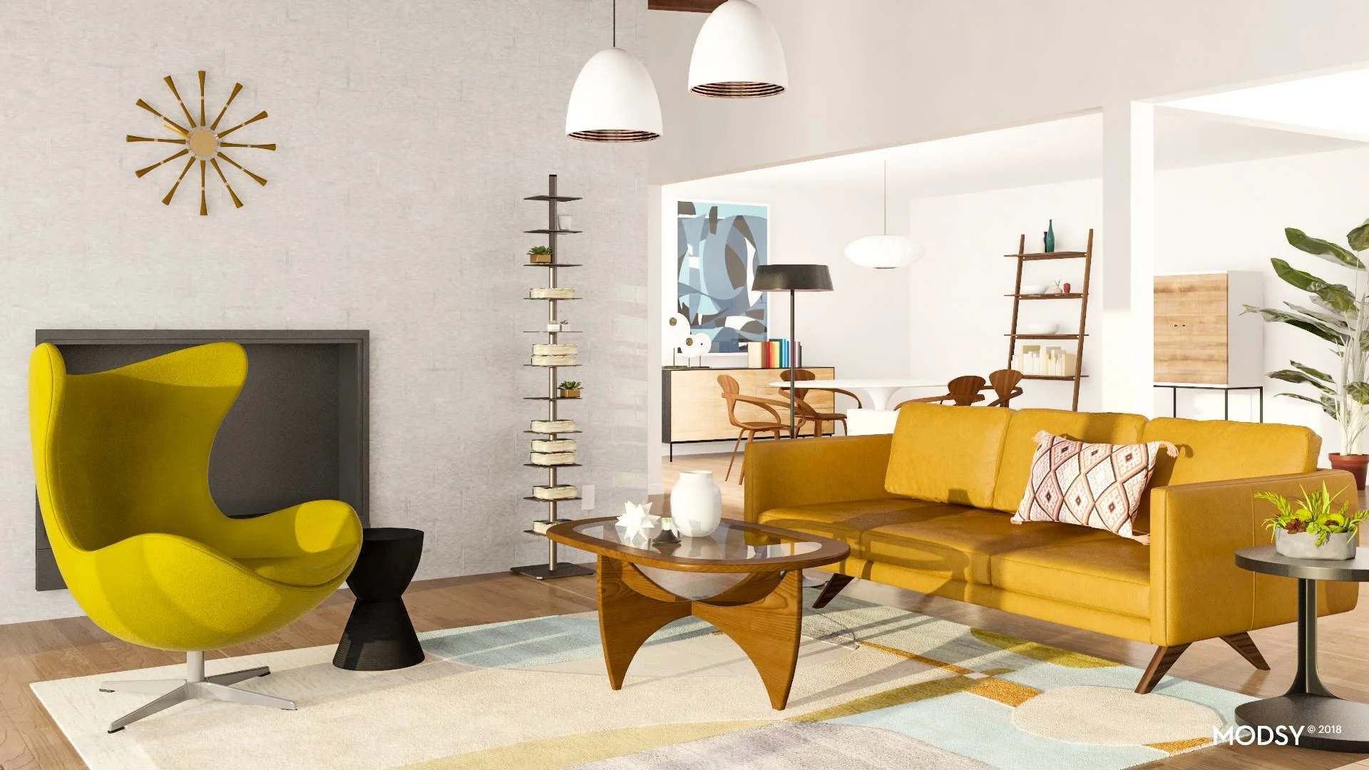
The style we hear people asking for the most, mid-century modern has been the “It” style that people want in their homes for a number of years. But what is this style? Mid-Century Modern is referencing a specific time period (generally from the 40s to the 60s) that was known for a specific form of modernism.
In these spaces you’ll find a lot of blonde and teak woods, primary colors, tapered legs, hairpins, an organic approach to forms and shapes, and a strong emphasis on geometry. During this time period, we see designers taking principles of the Minimalist Movement and rethinking them in a way that puts comfort more front and center.
Mid-century modern design in popular culture
These days you can’t throw a stick without hitting an Eames lounge chair in pop culture. Probably more than any other style, mid-century modern is the star of many movies and TV shows. Here are a few of our favorites that showcase this iconic style!
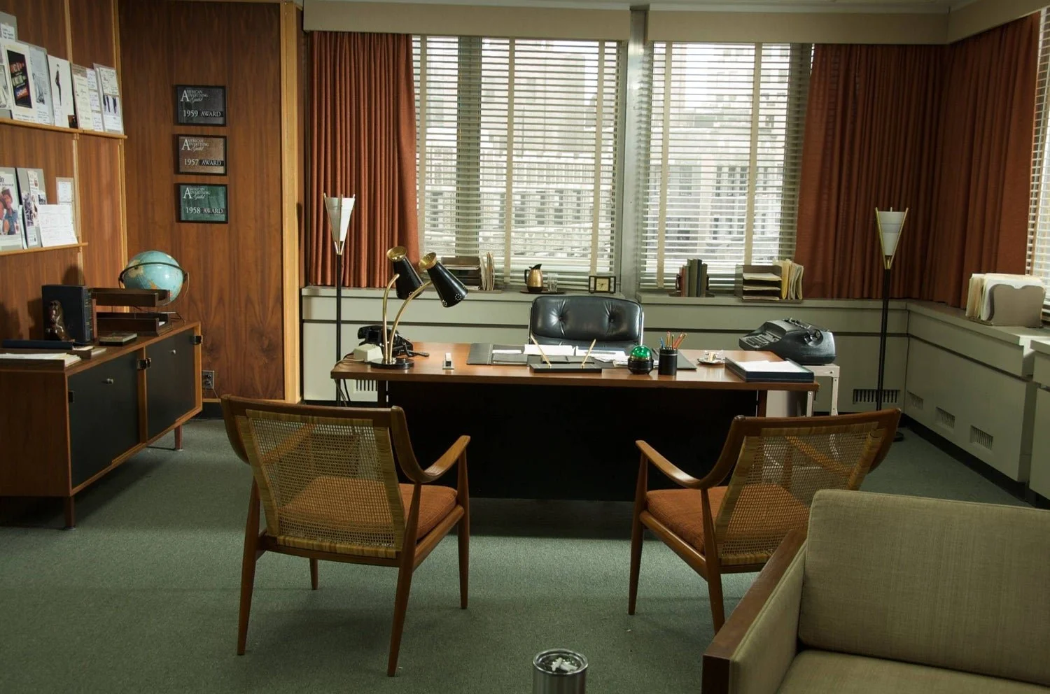
Mad Men
Our favorite mid-century bachelor, Don Draper’s office from the AMC hit show Mad Men sure had style. Bonus points if you can hit the Eames lounge chair with a stick!
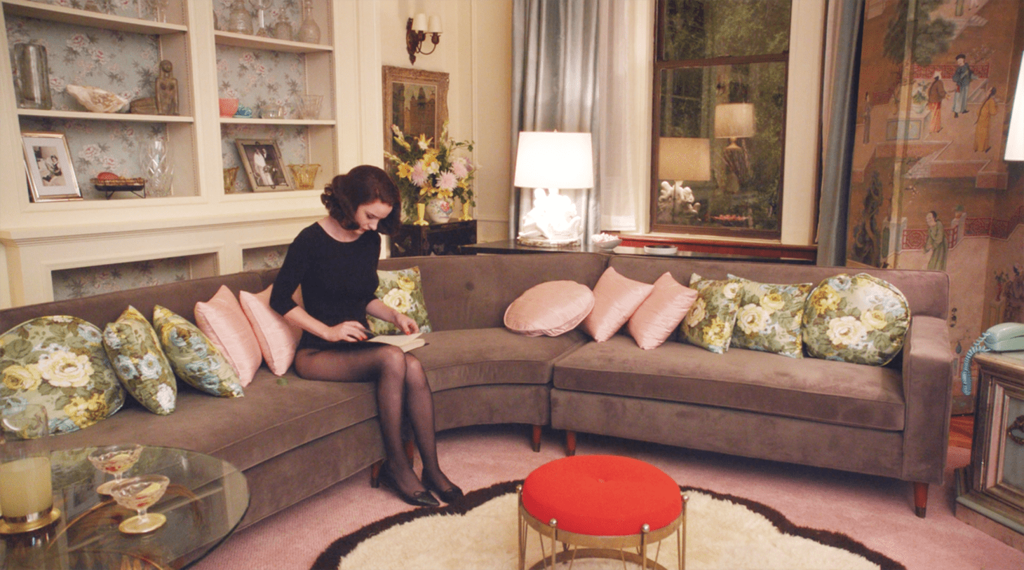
The Marvelous Mrs. Maisel
The elegant interiors of Amazon’s original series are almost as marvelous as the main character, Midge Maisel.
The Incredibles
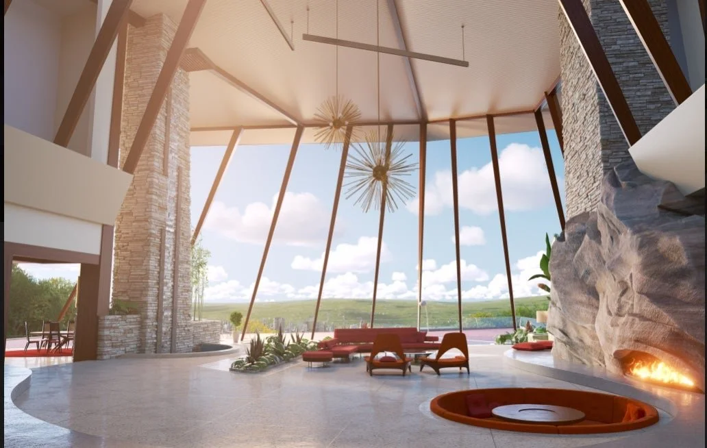
One of our favorite Pixar film series, The Incredibles 2 features an iconic mid-century home complete with a sputnik chandelier and conversation pit that would make Don Draper jealous.
Hollywood Glam Design
Traveling west to the golden coast, we find the style Hollywood Glam. Also known as glam, Hollywood regency, or even chic, this style is bold, dramatic, and over the top. And while this style couldn’t look any different from the retro interiors of mid-century modern spaces, this style actually came on to the scene during the same era!
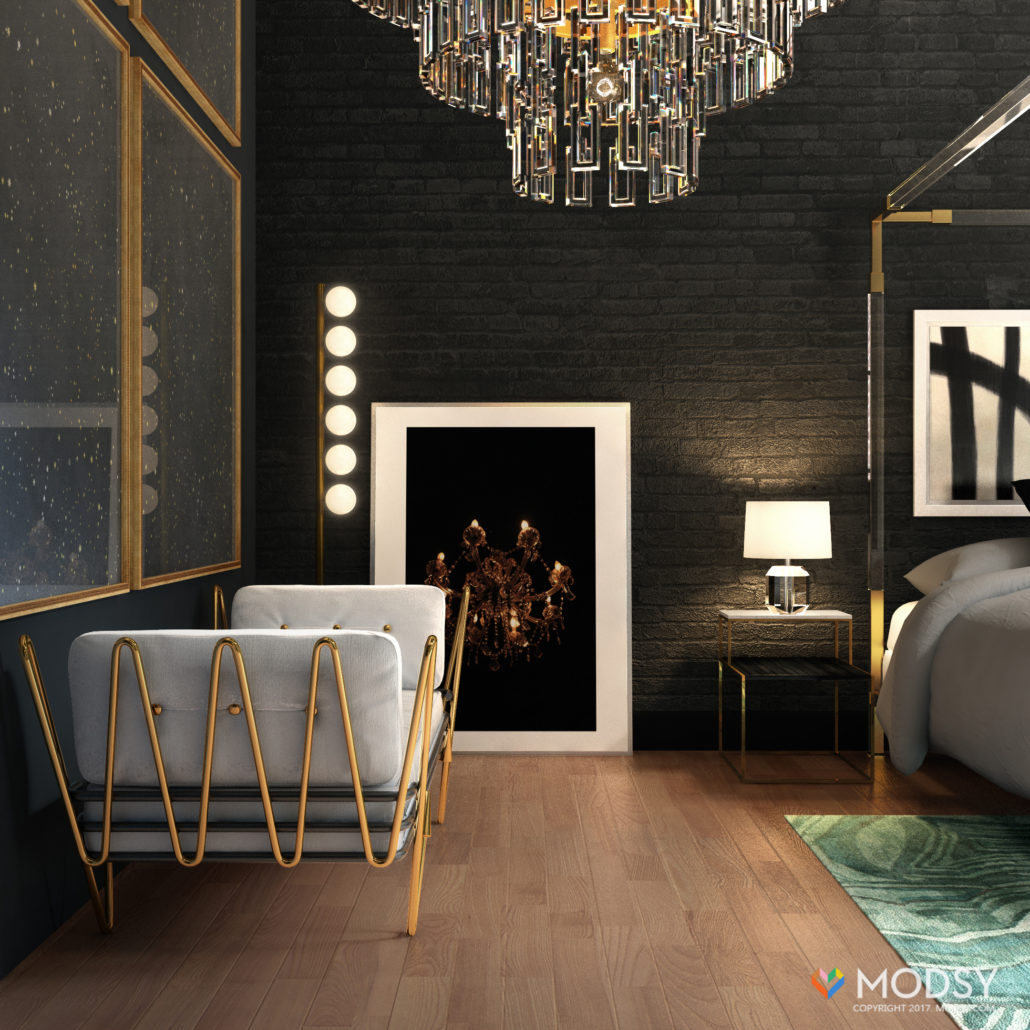
In these spaces you’ll find a lot of gold, brass, velvet, furs, mirrored surfaces, and animal prints galore. It’s a luxurious, quirky, and fun style that mixes different elements in a way that adds surprise and delight to a space.
Dorothy Draper’s Greenbrier Hotel
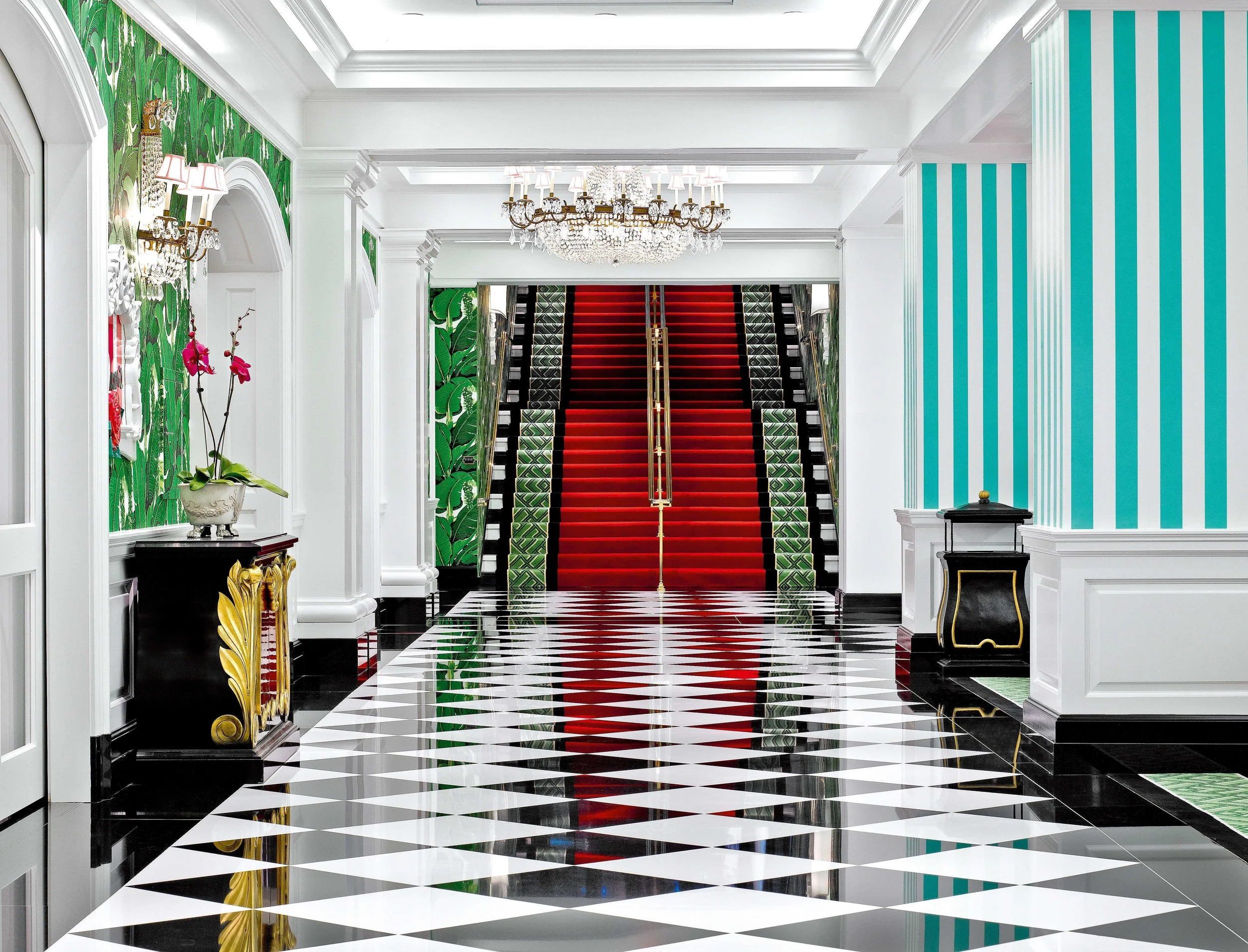
Iconic designer, Dorothy Draper, is considered to be “the mother of Hollywood glam style.” Her designs for the Greenbrier hotel (what Maddy calls the “original Instagram museum”) showcase this love of eccentric patterns, bright colors, and all around over-the-top designs.
Hollywood glam in popular culture
A style meant to be photographed and filmed, this look loves the spotlight! So it’s no surprise we see it in the interiors of some of our favorite pop culture interiors.
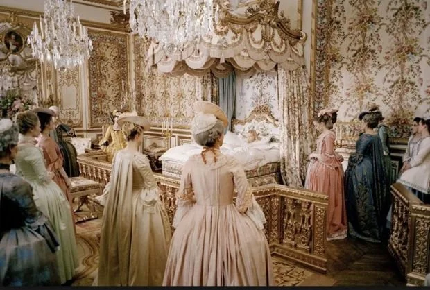
Sofia Coppola’s Marie Antionette
Talk about luxury, Sofia Coppola’s 2006 depiction of Marie Antionette’s life is full of glamorous style fit for a queen.
Global Eclectic Design
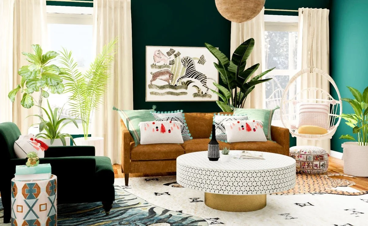
The word “eclectic” can mean multiple things. In one sense it describes an approach to style that’s about mixing different elements together. But in regards to a style type, eclectic (or bohemian/boho) is all about a collected, globally-inspired space that is informal and approachable.
This is the look for the world traveler and the flea market lover. In this style, you’ll find a mix of colors, patterns, furniture styles, asymmetrical layouts, and unexpected decorative touches. Out of all these styles, it’s the absolute least formal and all about breaking the rules of traditional interior design.
Global eclectic design in popular culture
A popular style for creating a relaxed vibe or for a young person’s space, here are a few places we’re seeing eclectic design in movies and TV shows.
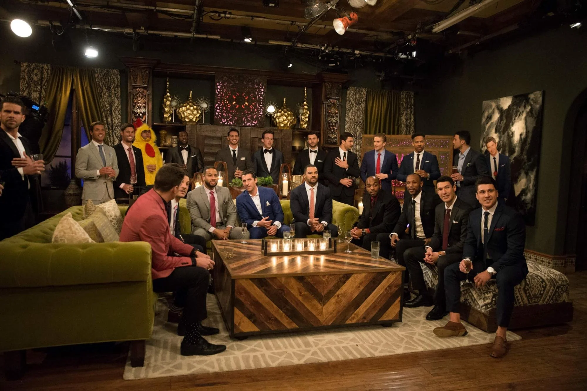
The Bachelor Mansion
Ever notice the design of ABC’s The Bachelor mansion? There are colors, patterns, and plants galore, along with design choices that create a relaxed and informal vibe like casual layouts, floor poufs, and daybeds.
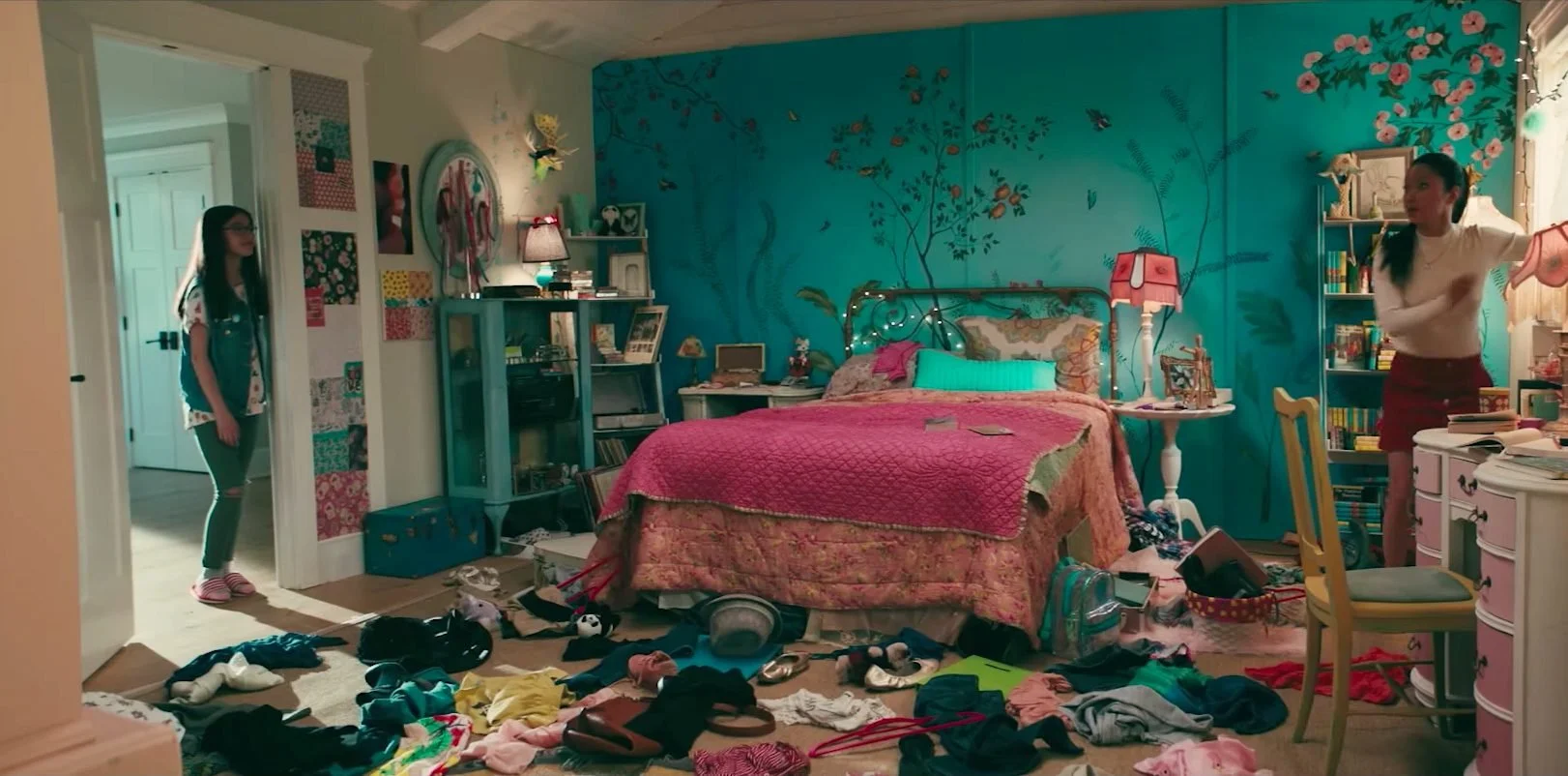
Lara Jean’s Bedroom, To All The Boys I’ve Loved Before
A youthful take on eclectic style, we’re obsessed with Lara Jean’s wall mural.
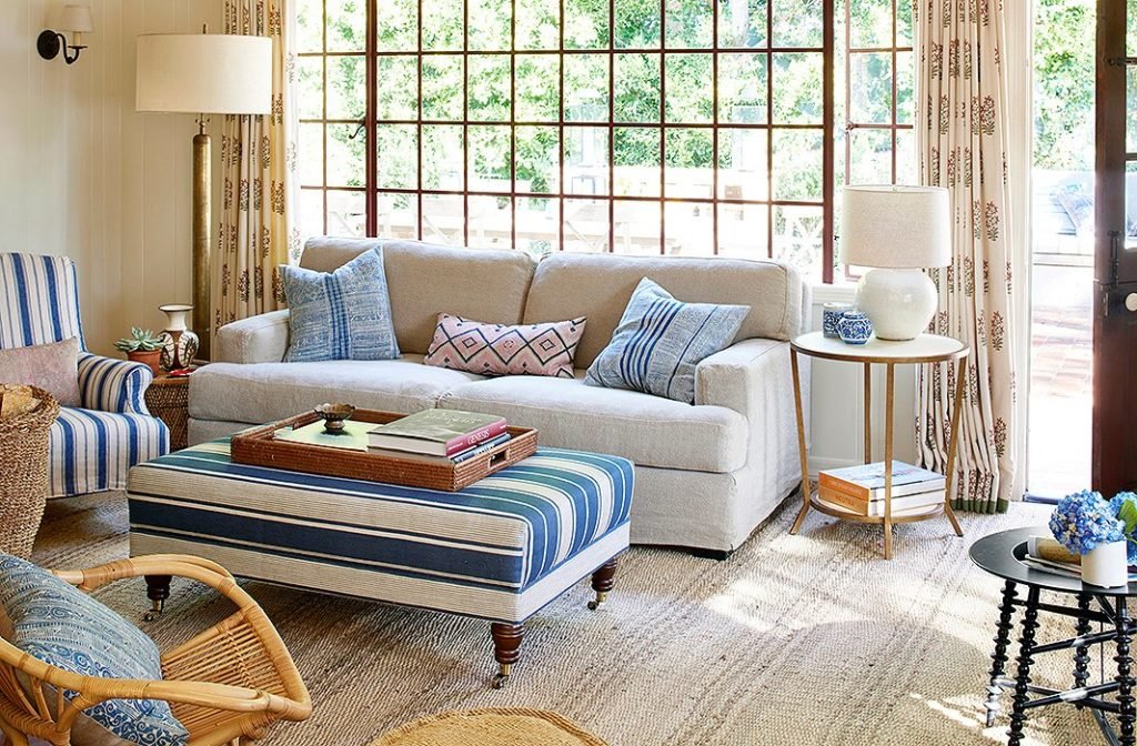
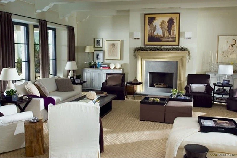
Nancy Meyers’ Home Again
In contrast to Lara Jean’s bedroom, the interior of Alice Kinney’s (played by Reese Witherspoon) home is the adult version of eclectic style.
Transitional Design
A timeless style, transitional interior design (also sometimes called contemporary) is unfussy and approachable. In these interiors, you’ll find a lot of neutral upholstery, dark woods, streamlined shapes, chrome finishes, and a strong emphasis on comfort.
Transitional is a great base style that you can layer other design aesthetics on top of. It’s definitely a “safer” style that’s hard to dislike because, as Alessandra notes, it’s a “style-less” style that’s really the bread and butter of so many homes.
Hotel furniture
The quintessential example of transitional style? Furniture in hotels. Nothing to be offended by here!
Transitional design in popular culture
Since this style is such a chameleon it can be hard to spot in the wild. Here are a few places we see it crop up in popular culture.
Amanda Woods’ Home, The Holiday
Amanda’s house from The Holiday is a great example of transitional design mixed with traditional influences. Rustic Design
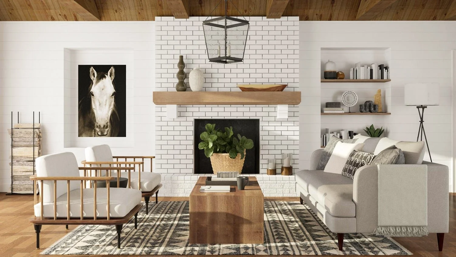
Another incredibly popular style, rustic design is a look that is comfortable, warm, and inviting. Inside rustic spaces you’ll find lots of texturous materials, like reclaimed wood, leather with a patina, sheepskins, sisal and jute, architectural fragments, and unfinished metals.
This is a style that can be spun in so many ways depending on your individual tastes. You can go log cabin rustic, farmhouse, modern rustic… the list goes on! But at their core, all of these styles are centered around creature comforts and a love of natural materials.
Rustic Design
Another incredibly popular style, rustic design is a look that is comfortable, warm, and inviting. Inside rustic spaces you’ll find lots of texturous materials, like reclaimed wood, leather with a patina, sheepskins, sisal and jute, architectural fragments, and unfinished metals.
This is a style that can be spun in so many ways depending on your individual tastes. You can go log cabin rustic, farmhouse, modern rustic… the list goes on! But at their core, all of these styles are centered around creature comforts and a love of natural materials.
Rustic design in popular culture
When we think about how design makes you feel when you’re experiencing it, rustic is a style that makes you feel comfortable, supported, warm, and cozy. Not a bad place to be. Here are some places we’re seeing rustic design on the big screen!
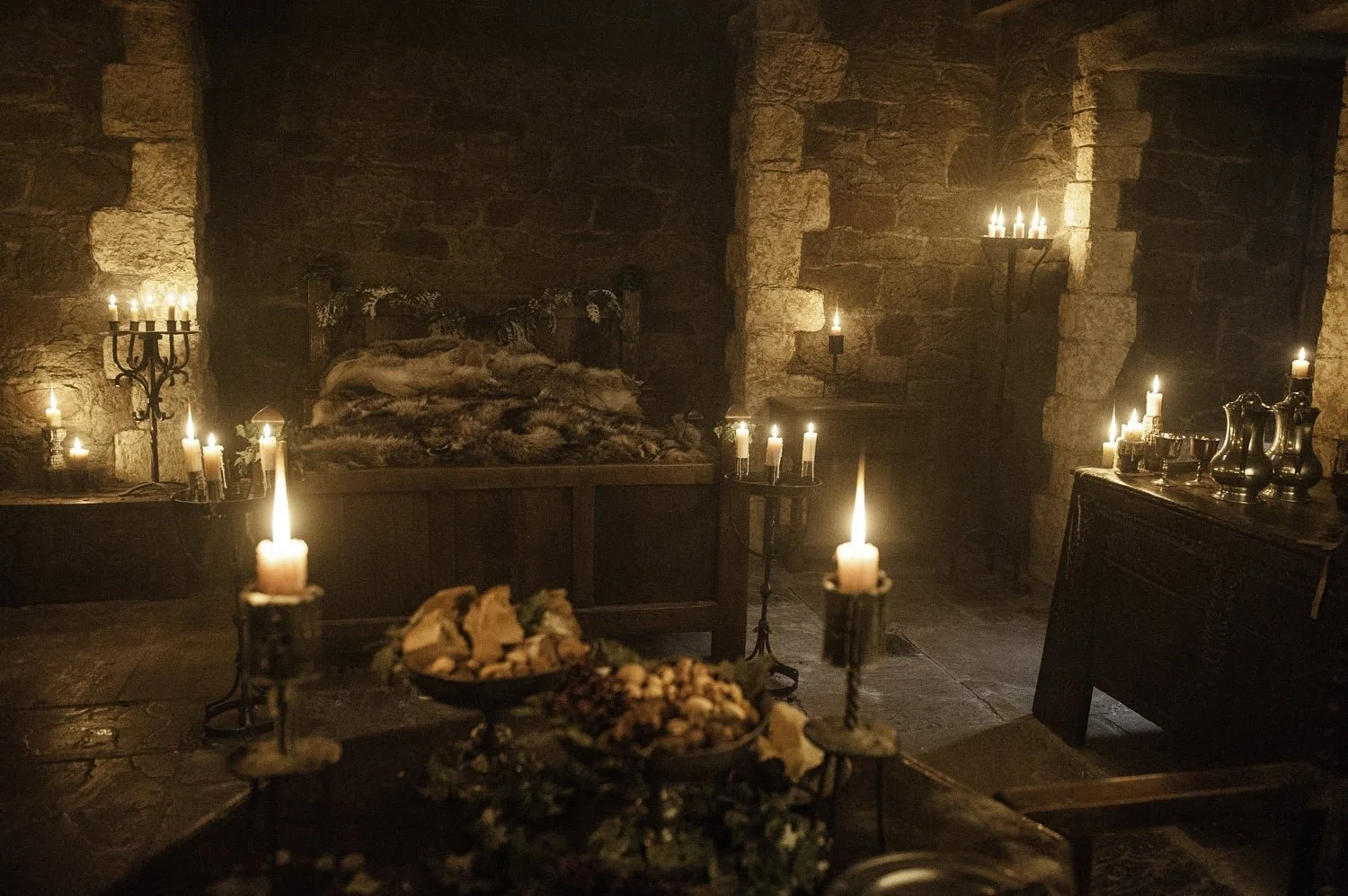
Winterfell Castle, Game of Thrones
It doesn’t get cozier than the rustic interior of the Winterfell castle.
Chip and Joanna Gaines’ Fixer Upper Style
Joanna Gaines is without a doubt our idea of the quintessential rustic style icon.
Industrial Design
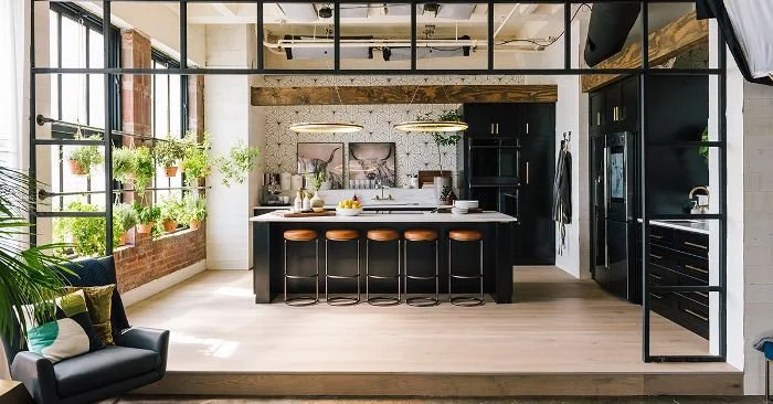
A close cousin of rustic, both industrial and rustic design are into a vintage and rugged past, but industrial is more about the warehouse look. Spaces designed in this style embrace the use of industrial materials (what you’d see in an old-timey factory setting) like edison bulbs, exposed ductwork, pipes, unfinished woods and metals, and leather.
Historically, the industrial style comes from loft spaces. As warehouses were converted into lofts, many of which were lived in by artists like Andy Warhol, they were designed with the space’s history in mind.
Industrial design in popular culture
Does your favorite movie character live the loft life? Some of ours do! Here are a few places we see industrial design in popular TV shows.
New Girl Loft
Jess and co live in this trendy, urban loft in LA. It’s a cheery take on industrial style.
Queer Eye Loft
Warmed up with pops of brass and leather, the Queer Eye loft is a great interpretation of industrial style with an infusion of comfort.
Note: This post was originally published on blog.modsy.com (archived) and developed as a visual guide to episode 1 of The Render.
